Brooklyn Dispatches
Most of us toil away, day by day, grinding out an existence, our lives punctuated occasionally by small events.
James Kalm / The Brooklyn Rail
01 Jun, 2011

Most of us toil away, day by day, grinding out an existence, our lives punctuated occasionally by small events. We take note of happenings and trends in the larger world while we’re imbibing the infotainment media. Rumors and reports of foreign revolts and wars are acknowledged, their import diminished by their distance, and we soon return to our cocoon of self-absorption. Then shit happens. Vague cataclysmic forces align, pressures build, and BANG, the dam breaks. We’re smacked so hard by events that we see stars. Whether it’s the rubout of Osama bin Laden or the momentous happenings of the “Arab Spring,” in hindsight we realize that these outcomes were inevitable, if only we’d been paying attention.
Meanwhile, on the other end of the spectrum of importance, developments that could only be related to the above as punch lines or symbols of myopia continue to happen in and around Brooklyn. Pay attention.
I’ve written recently about the shifting communities of Williamsburg and its art scene heir-apparent, bustling Bushwick. One often-heard caveat has been Bushwick’s wide dispersion—its lack of an easily accessible central core, the grain of sand around which an artistic pearl could form. As of this May, longtime Williamsburg venue Momenta Art heads east to open its new 4,000-square-foot space at 56 Bogart Street. Not only will the new location provide larger exhibition space, but it will also include a dedicated gallery for its ever-expanding video archive. Plans are also being drawn up to convert a section to studio spaces, available at “below market rates” with an eye towards establishing an artist residency program. Located directly across from the Morgan Street stop on the L line, Momenta will sit around the corner from Paul D’Agostino’s Centotto and just blocks away from English Kills, Storefront, and Factory Fresh. As of this writing (mid-May 2011) word has it that another well-known publicly funded institution from the nabes (whose director pledged me to temporary silence) is in negotiations to relocate to this address as well, in which case this building could form a beachhead of “not-for-profit” spaces that would benefit greatly from their mutual proximity.
Meanwhile, out east, Brooklyn’s art mojo finds itself rubbing up against Queens. Longtime Williamsburg artist and activist Fred Valentine is converting a sizable portion of his studio into something that is as yet indefinable. As an early contributor and organizer of Organism, the multimedia funhouse that became known as the Mustard Factory, as well as a curator for the original Galapagos nightclub when it debuted on North 6th Street, Valentine has developed a network of local artists that is both broad and deep. The appropriately named VALENTINE at 464 Seneca Avenue is tentatively scheduled to open on July 1. Though eschewing the goals of a commercial gallery or project space, Fred has stated that he’d like to create an environment where “people could come sit, look, talk, and think about art,” and where folks of different sensibilities, generations, and approaches could form knowledgeable relationships with each other. However this endeavor develops, there should be no shortage of healthy dialogue and experimental presentations to partake in.
Maybe I’m just lazy, or, as I like to think, otherwise engaged, but I tend to shy away from reviewing group shows, especially the ones with rosters of artists that run into the tens, twenties, and thirties. The age-old rule of thumb is that 85 percent of the work in most of these shows just doesn’t click, and so you’re left focusing on the small percentage that jives with your taste. However, recently I was lucky enough to catch a couple of shows that pushed the “good quotient” up a notch or two. One Dozen Paintings at the Journal Gallery in Williamsburg was a refreshing collection of monochrome paintings that included an impressive list of contributors. With a slacker curatorial indifference to what is monochrome, the show’s wide range of methods and approaches sets up a dialectical comparison between clean, disciplined formalists and younger, grubby-handed, eccentric funksters. This contrast leaves viewers to ponder the properties of materials, their applications, and even what criteria constitute a “painting.” Two small silver-deposit pieces by Jacob Kassay present a metallic surface that shines like a mirror, which can’t be viewed without pondering the alchemy-like process of their fabrication. During my motorcycle days, I had friends who achieved similar results using the plating tank at the local chrome shop. Rumors of market manipulation have already attached themselves to this young formalist (), who was featured last winter—along with Robert Morris and a couple of other artists—in what appeared to be an audition for Neo-Minimalist at Mitchell-Innes & Nash.
An elegant, square slab of black polyurethane truck liner paint by Olivier Mosset brings to mind Ad Reinhardt, but the orange-peel texture of this unmodulated surface has the readymade industrial quality of a paint chip sample or a factory test swatch. Another artist included in the show, who’s been getting considerable attention, is the Californian Tauba Auerbach. Her contribution, a medium-sized piece composed of vertical stripes, veers from the single-color theme as much as any work in the show. The soft, grayed-out blues and violets have the stained, atmospheric quality of tie-dye, but they may involve some kind of tricky use of spray paint. “Untitled,” a painting composed of rusty metal, primer and Rust-Oleum by Ned Vena, is a rich brown that on closer inspection is lined with corduroy-like ridges. These patterns repeat and dissect the rectangular support of the canvas, recalling a pinstriped version of the early “Black Paintings” by Frank Stella. A funkier example is “Eleven P.M.” by Sarah Braman. Rescued, recycled, repurposed, or whatever term is currently in vogue, this work is painted on part of a wear-worn hollow-core wooden door, with its honeycombed interior exposed on its right side. A square chunk of the frame extends from the lower right corner, adding a horizontal thrust, violating the rectangular shape, and countering saw-cut lines in the upper edge of the panel. The sensual facture of the rich blue enamel comes down on the less “formal” side of the dialectic, benefiting from the touch of the artist’s hand. A Rough Cuts video walkthrough of this show is available at .
A stop at Fist City at the Fowler Arts Collective was like entering a time machine telescoping the last century. Located in a massive, crumbling hulk of a warehouse on northern Greenpoint’s East River waterfront, the Fowler Collective is a several-thousand-square-foot space housing a number of studio cubicles and a gallery. Arriving after dark on an overcast spring evening, I rode half a block through an enclosed alleyway to enter. In the film noir gloom, I halfway expected to see WWII sailors nuzzling floozies in the shadows, or petty gangsters unloading illegal hooch for downtown speakeasies. After climbing stairs to a suspended walkway, I entered the ruggedly constructed exhibition rooms and smelled cut-pine studs, sheetrock dust, and latex paint. Suddenly I was transported into Williamsburg 1982. But the works on display, mostly medium to smallish paintings and works on paper, were totally contemporary.
Several small ink-on-paper pieces by Nathlie Provosty made me take a second look. Provosty’s skillfully executed ink wash paintings are all “Untitled” and employ trompe l’oeil techniques of shadowed cubistic overlays and hazy atmospheric bleeds that function like effigies of photographic collage. Some compositions are laid out with a hierarchical symmetry, but their illusionistic depth induces a visual drifting between layers. From these simple elements, a Surrealistic narrative evolves that can seem tragically nostalgic due to their humble means, a bracingly simple palette of black and white.
Matt Phillips riffs on Pattern & Decorative, the psychedelic, and other wacky variations of obsessive/eccentric art, but never discards the tropes of advanced abstract painting. In “Out of the Blue Into the Black” (2010), a sunburst form in shades of blue is framed by collaged patches of harlequin check. The title is squirted on in juicy, loopy script, recalling notes from a teenager’s diary. The plethora of illusions and influences, coupled with the labor-intensive process, might suggest the rare happenstance that Phillips is looking at too much contemporary painting.
If anyone could misspell the first name of EJ Hauser, it’d be me. And like her name, EJ’s paintings seem so urgent and abrupt that they could be seen as painterly reductions of content into acronyms. I was recently asked if there were any trends I’ve noticed lately. After some thought, I realized that I’ve been seeing a lot of what I’ll call (in the very best sense of the term) “crappy little abstract paintings.” Artists like Jimbo Blachly at Winkleman, Katy Moran at Andrea Rosen, and Tom Burckhardt at Pierogi have all trotted out small, serially produced groups of paintings, often executed on whatever’s at hand. Their appeal is quirky, abject, and cursory. With only four paintings by Hauser on display here, I’m not in a position of expertise, but these pictures seem more like unpretentious sketches or notes than fully worked out ideas. However, such unrehearsed outbursts are often far more successful in capturing spontaneous gestures and happy, irreproducible accidents. As an example, there’s a sense of changing direction in “Dickhead” (2011). A head and shoulders are briskly brushed in robin’s egg blue over a more controlled orange and ultramarine ground of hard-edged, geometric stripes. A blithe attack thus turns an unsatisfying abstraction that had probably been kicking around the studio for a while into a cocky reintroduction of figuration—nice.
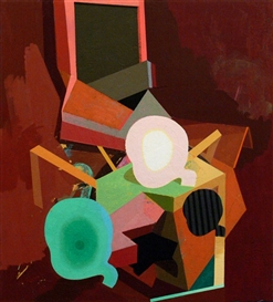
Logan Grider produces well-wrought abstractions with subtle blocks or pure color and nubby surfaces that echo mid-20th-century organic Modernism. Grider is a Westerner hailing from Salem, Oregon, and his curvy, interweaving imagery, and the way the figure/ground reading of his forms tends to flip, made me curious about whether he’d encountered any work by the “Indian Space” painters. This underappreciated group of Downtown American artists in the mid-1940s held sway (Steve Wheeler, Peter Busa, Will Barnet, Robert Barrell, Ruth Lewin, et al), along with some dealers and critics, produced several exhibitions and published their own magazine, Iconograph. Their investigation of Northwest Coast Native American motifs and myths runs parallel to the search for European archetypes sought by the Surrealists and their New York acolytes like Rothko, Baziotes, and Gottlieb. Grider’s “Double-Dealing” (2009) positions a head-like ovoid form in a thick blue outline on a rusty red ground. An ochre “snake” emerging from the background seems to curl through an open circle that could be a mouth in a profile, perhaps a visual illusion to the phrase “speaks with forked tongue.” All in all, Fist City was a satisfyingly strong show of promising talent. For a video tour visit: .

 ARTISTS
